The traditional way of increasing sales has been to create a landing page and then optimize it to attract more and more customers.
The problem with many websites is that the landing pages still have text blocks that are boring. Adding video to a landing page can transform it into something much more engaging with more chances of converting the visitors into customers.
So, In these times, when more than 500 hours of videos are uploaded to YouTube alone in a single minute, you have no excuse for creating boring landing pages.
In this guide, we will describe how you can spice up your landing pages with video.
We will start with some background and then move to how video landing pages help increase sales. We’ll then present some great video landing pages examples, followed by several tips for optimizing your video landing pages.
- What Are Video Landing Pages?
- Videos That Perform Well on Video Landing Pages
- Where Should You Place Videos on Landing Pages?
- How Videos Help Boost Sales
- Five Great Examples of Video Landing Pages Done Right
- Presto Player – A Great Solution for Adding Videos to Your Landing Pages
- Add the Power of Presto Player
- Tips for Boosting Sales Through Video Landing Pages
- Keep On Experimenting
- Wrapping Up
What Are Video Landing Pages?
Video landing pages are landing pages that contain a video to attract more leads or convert visitors into customers.
These pages can be standalone or be part of a marketing campaign. The typical outcomes expected of video landing pages are to sell more products, persuade visitors to opt-in for a newsletter, or simply present your products and services in an attractive package.
While the idea of using videos on landing pages might not be new, it has certainly become more productive in terms of achieving business targets. In a study by Wistia, it was found that people spent 2.6x the amount of time on pages with videos.
Why is this number significant?
Since users spend more time on video landing pages, the dwell time of these pages is significantly higher. Dwell time is a major Google ranking factor, so it follows that video landing pages contribute toward increasing the standing of the website in Google’s search results. As a result, your website appears higher in the search results, with more visitors and potential customers clicking over.
However, not all types of videos can be used on these pages.
Videos That Perform Well on Video Landing Pages
The following four types of videos perform well on video landing pages because they align perfectly with the expected outcomes.
Promo Videos
If your landing page is about promoting an offer for a product or service, promo videos showcase the benefits the visitors would receive if they opt for the offer.
Demo Videos
Demo videos demonstrate your product to visitors. These videos offer a high-level view of how your products and services benefit the user while also giving them a much clearer idea about the product in question.
Explainer Videos
Explainer videos are often used to explain how specific features of products and services can help viewers achieve their goals.
Testimonial Videos
These videos are ideal for convincing the viewers to opt for your offer. Testimonial videos show people similar to the viewers endorsing your products and services and leverages social proof to help convert.
Where Should You Place Videos on Landing Pages?
Now that you have a list of types of videos you can create for your website, the next decision is where you should place these videos. Remember that improper placement might turn off visitors, so it’s something you need to get right.
Here are a few popular video placement options that you can try.
Front and Center
Also known as the Hero Video, these videos are generally placed above the fold. In many cases, the video replaces the header image on the page. As you can imagine, the video is often the first thing the visitor sees when visiting the website.
Usually, these videos are about testimonials or product demos. The idea is to catch the visitors’ attention and get them interested in your products and services.
Background of the Page
You can also place the video on the page’s background. While this attracts visitors’ attention, they might ignore the video. As such, you should only use these videos to attract attention rather than showcase the product.
Consider implementing a background changer feature that seamlessly transitions visuals behind the content, providing a dynamic and engaging backdrop without distracting visitors from the main video content.
Between the Content of the Page
This is the most popular placement for videos. Usually, these videos are located in the middle of the page between content elements). These videos generally support the contents of the page.
A good example of this type of videos is customer testimonial compilation playing right under the product features.
Popup
You will find mixed opinions about popup videos. On the one hand, you’ll find website owners praising the fact that they can place multiple popup videos on a landing page. On the other, you’ll find users who criticize popups as well as popups with multiple videos.
Usually, you can place explainer videos or product demos in popups, but think carefully about how your target audience would receive them!
How Videos Help Boost Sales
Video on landing pages is about much more than just decoration. They supplement page contents and give visitors a sneak peek at your products and services.
Here are the significant benefits videos deliver for your brand:
Videos Present Product and Service Walkthroughs
Videos capture the attention of visitors like no other format. According to Wyzowl, as many as 96% of survey respondents mentioned that they viewed an explainer video before buying the product.
Videos Draw Attention to Your Offers
Adding a call to action (CTA) at the end of the video is a proven tactic of getting the viewer to take the desired action. You might have seen CTAs at the end of the video, asking a question or suggesting the following action, such as booking a call or subscribing to a newsletter. You should also consider incorporating AI text-to-speech in these videos to reach a wider audience, including those who prefer listening over reading, thereby broadening the accessibility and appeal of your landing pages.
Videos Entertain Viewers
For almost all users, videos are primarily a source of entertainment. That’s the reason marketers prefer it over other formats. It is easy to slip in your offer when the viewer has viewed the video. Since they have viewed the video and likely feel goodwill towards you, there is a much better chance that they’ll accept the offer.
Five Great Examples of Video Landing Pages Done Right
At this point, you know what types of videos work for landing pages, where to place them on pages, and the benefits of adding videos to your landing pages.
Now it is time to show you some brands that did video landing pages right!
Kinsta
Kinsta is a managed hosting platform that works with clients from all over the world. They use videos on their pages to impress visitors.
They have created a series of landing pages to show how their platform adds value to their client’s business operations. Here’s an example.

As you can see, Kinsta embedded a rather long video in which a client elaborates how Kinsta benefits their business. This video is located in the second fold and gives the visitor a choice to watch the video or read throughout the page.
Meltwater
Meltwater is a SaaS business that delivers social media listening and management services to its clients. Their careers page has a great video.

This video is the first thing visitors see when the pages load. They can see the diversity in Meltwater’s workforce and the happiness of the people working there. The video sets the tone for the rest of the page that describes the benefits and perks.
Crazy Egg
Crazy Egg is a popular platform for recording and analyzing visitor behavior on websites. The target audience includes agencies and eCommerce store owners. They have created landing pages targeting each segment of this target audience.
Here’s the page for agencies.
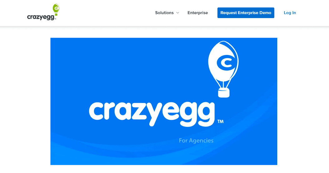
As you can see, they have a great video in the middle of the page explaining how Crazy Egg is a great fit for agencies. The video sums up the benefits agencies get when they work with them.
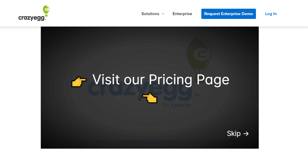
In this video, they included a CTA to visit the pricing page at the end of the video.
The page also has another video below the fold. This video shows how Crazy Egg is used to analyze a website. This is a practical demonstration of the features to further encourage conversion.
Mailchimp
Mailchimp is an email marketing platform used by everyone from small businesses to huge digital marketing agencies. They have a very diverse user base that requires detailed explainer videos to understand Mailchimp’s platform.
Here’s one of the resource pages that have an explainer video above the fold.
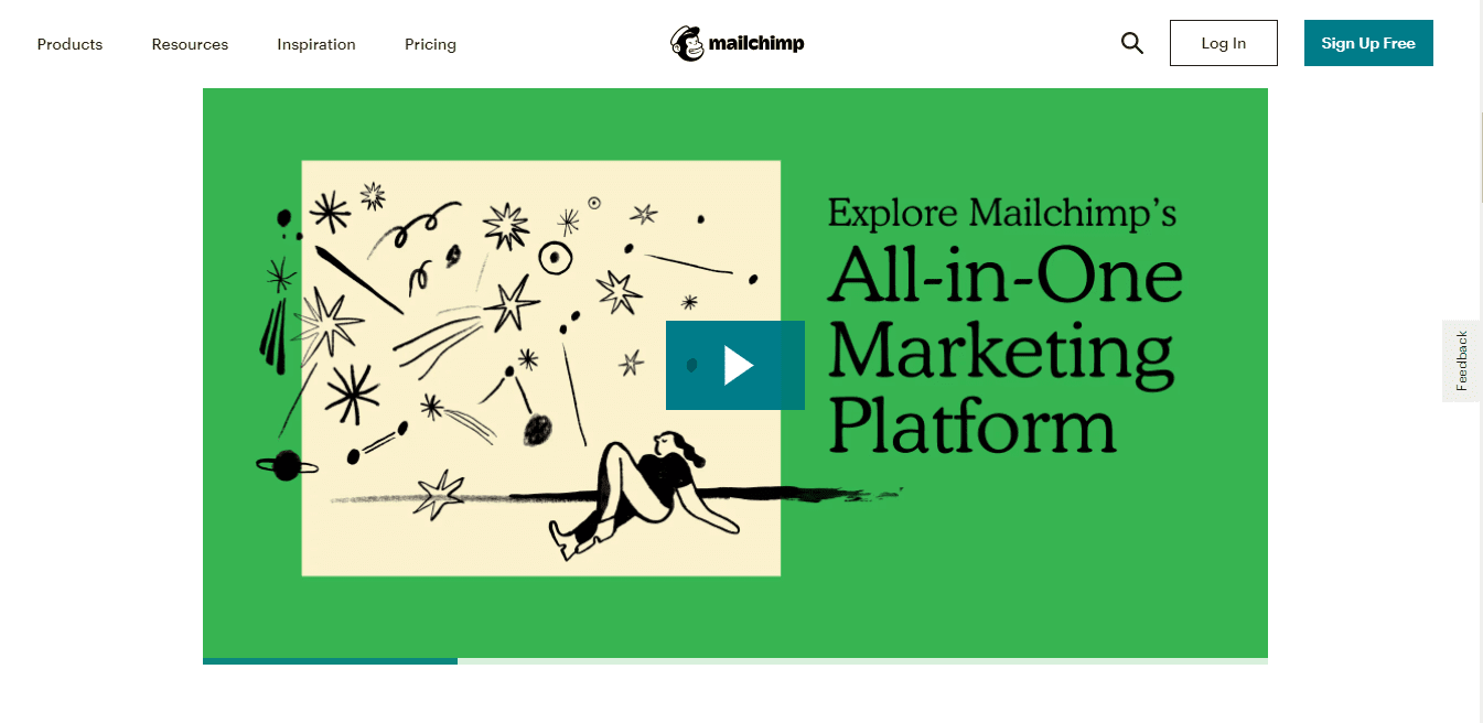
The rest of the page has a dedicated CTA for subscribing to their email list and links to related resources.
HRdownloads
HRdownloads is a Canadian platform that delivers everything from documentation to employee management consultation, making it one of the best talent management software.
The homepage of their website has an interesting video in the background.

This video plays in the background and supports the central theme of the page to reinforce the primary message.
Presto Player – A Great Solution for Adding Videos to Your Landing Pages
Video landing pages are distinct from other pages on your WordPress website. Embedding video(s) in a page requires a comprehensive video player that can embed and play all types of videos and fit seamlessly into your page design.
Here’s where Presto Player comes to the rescue.
Presto Player is an innovative WordPress plugin that goes beyond the traditional role of a video player. In addition to a fully customizable player, you get a complete solution for using videos as an important aspect of your marketing strategy.
Let’s start with how you can add a video to one of your landing pages.
For this demonstration, we’ll assume that you have already identified the area where you want to place the video.
Embedding a video is simple. All you need is your video that can be hosted anywhere. Presto Player supports several video sources, including your server, YouTube, and video CDN solutions such as Bunny.net.
To simplify the embedding process, Presto Player offers several blocks for embedding videos.
This selection comes in handy when your video is hosted at YouTube, Vimeo, Bunny.net. Similarly, you have separate blocks for embedding private videos that only authorized users can view.
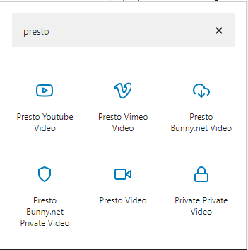
With Presto Player, you can embed videos from any video host that provides shareable links by using the Presto video block.
To illustrate the process of embedding, we’ll show you how to embed a YouTube video. All you need is the URL of the video and Presto Player YouTube video block.

At this point, the video is ready to be published.
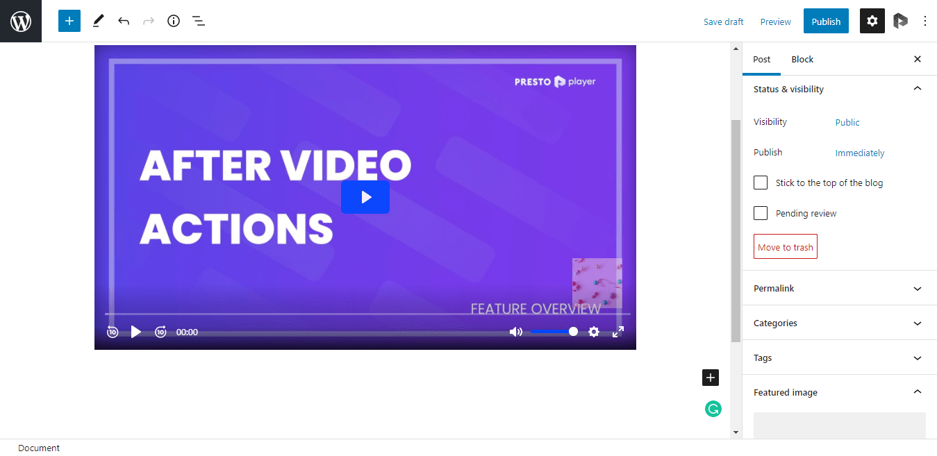
Add the Power of Presto Player
While the video is good to go, you have yet to use the features of Presto Player that make it the preferred choice of marketers and course creators.
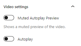
Muted Play Options
Muted play option is a great way of attracting visitors’ attention to your videos without sacrificing the user experience. These videos play without sound until the visitor clicks the player.
They are an excellent way to overcome some users’ dislike of autoplay videos and work incredibly well.
To enable muted play for your videos, simply toggle the Muted Autoplay option under the video settings panel.
Apply The YouTube Preset
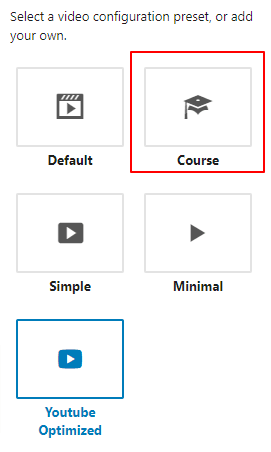
A preset is a combination of several settings, including player control position, action bar, and CTA position.
Since we have added a YouTube video, we can enable the YouTube Preset to optimize the experience. You can see that the player controls have been moved around to fit the YouTube experience better.
There are other presets that you can use if they fit your requirements.
For instance, if yours is an educational video, you can select the Course preset for optimizing the experience.
Make Your Own Presets
As you already know, all videos are not the same and require a different combination of CTA placement, email subscription, and player control combination.
With Presto Player, you can create custom presets that combine several options to suit your requirements.
For this, simply click Custom. You’ll lead you to a Preset Builder window where you’ll see all the options you can combine to come up with your custom preset.
Read more about custom presets here.
Adding Email Capture Fields
Since capturing email addresses is an important reason marketers use videos, we’ll now demonstrate how you can add this option.
For this, you need to create a custom preset by clicking Add New Preset.
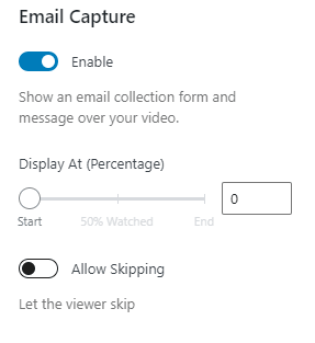
You’ll be taken to the Preset Builder window. Here you’ll see Email Capture at the fourth position. Click the toggle to access the available options.
You can choose when the email capture field will be visible to the viewer in the top half. While you can set it to any value, the recommended practice is to show the field at the end of the video as a CTA for subscribing to the email list.
Add a Call To Action
Similar to adding the email capture field, adding the CTA to your videos is a matter of finalizing a few settings.
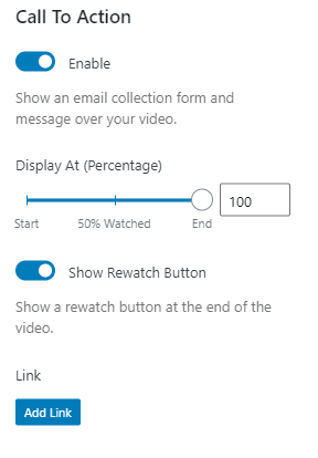
The Call to Action option is the fifth option on the Preset Builder window. Clicking the option will take you to the Add to Action options screens.
Just like the email capture field, you can choose when to display the CTA. With this option enabled, the viewer will see a dedicated rewatch button that could take them to the start of the video.
If you wish the viewer to go to a URL, you can click Add URL.
If you wish to see all the significant features of Presto Player in action, visit our website. Here you’ll find Adam explaining all the essential features. You’ll see the video playing in muted autoplay with captions underneath.
Tips for Boosting Sales Through Video Landing Pages
At this point, you have a good idea of what video landing pages are and how you can integrate videos within your landing pages using Presto Player. It is now time for some tips for structuring the video landing pages and optimizing them for better ranking in Google’s results.
One Video Per Page!
A single video means so many benefits for your sales. So, should you add more videos to your landing pages to compound the ROI?
Well, no.
Videos capture the viewers’ attention and make them more receptive to your pitch. However, by adding multiple videos, you increase the risk of diluting your message and confusing the viewer.
Multiple videos should only be used if they are part of a series of feature explainer videos. That way, you can build upon the message of the previous video to get the user to transition to the next.
Keep it Below 90 Seconds
Remember the popular fact about the window you have for grabbing the attention of website visitors?
The same is true for video.
You need to make sure your videos do not run for so long that viewers lose interest. Like the three-second rule, video has the 90-second rule. Usually, demos and explainer videos run for 90 minutes, while testimonial videos should not exceed 60 seconds.
Start with a Tight Script
All great videos start with a great script.
Scripts have the potential to hold the viewers’ attention and deliver your pitch in an exciting way. However, writing compelling scripts is a learned skill.
Writing scripts is all about explaining complex ideas and details simply, so anyone can understand. Even for expert product content creators, that is easier said than done!
Scripts should be put through a process that filters out any difficult words and preferably checked by someone close to the target audience to make sure the core message is effectively delivered.
Make Sure The Thumbnail Reflects the Central Idea
Thumbnails or poster images are often the first things viewers see about the video.
Many creators opt for clickbait thumbnails that are supposed to make visitors click on the video link.
However, this strategy backfires when expectations are dashed, and the viewer realizes the image bears no relation to the video. This will cause them to drop out before they reach your offer.
Autoplay or Not to Autoplay?
Autoplaying videos are a thorny issue in website design.
Marketers want the video to start playing as soon as the video loads up to maximize its reach. Visitors don’t.
Autoplay videos are generally discouraged because nobody likes to be startled by a loud noise when the page finishes loading.
However, there are scenarios where autoplay videos can benefit the user experience.
Two such scenarios are videos in the background that plays on muted autoplay. When used properly, they can complement the message on the landing page without annoying visitors.
The other scenario is when visitors expect the video to play as soon as the page loads up. A popular implementation of this idea is when a user clicks an ad that promises a video, and the video starts playing as soon as they land on the page.
Don’t Sell
Asking marketers NOT to sell is a hard sell indeed!
However, the truth is that nobody likes an offer being pushed into their face. The primary reason why people watch videos is to be entertained and not to be sold to.
So, before everything else, make sure your videos don’t sell but entertain. This ensures that you have their attention.
The next step is to educate your audience. The idea is to show how your products and services benefit the audience. This is where the sales part happens very subtly. In many cases, there is no mention of discounts or special deals.
There is a very fine balance between shoving an offer down their throat and gently nudging the viewer toward your features and pricing page.
Place Videos As High as Possible on the Page
Videos are meant to capture the attention of visitors, so it makes sense that videos should be among the first things visitors see.
However, this is a question of optimization, and many website owners prefer placing the video in the lower half to beef up the message of the page. This is usually the case with testimonials.
Note that if you place the video above the fold, make sure the thumbnail sets up the right expectations as the video loads up.
Reduce the Clutter
As mentioned above, videos are meant to capture the attention of visitors.
Many web designers make the mistake of surrounding videos with background images and blocks of text. This defeats the purpose of using videos, as visitors might miss them among the clutter.
This is the reason why you often see videos as the only element. This is a common setup on webinar promotion pages. Once the webinar happens, the video is often embedded in a separate element followed by a description of the topic and an introduction of the participants.
Don’t Forget Search Engine Optimization
Google gives special treatment to videos. With all other factors being equal, pages with videos are ranked higher in Google search results.
The problem with this idea is that everyone knows it.
So how can you get the edge over the competition?
Simple. Apply the SEO best practices to optimizing videos so that Google gets the right signals from your website. These practices include adding the right keywords to your video description and the page’s meta content.
Match the Player With Your Website Design
You might have seen videos on websites and then thought at once that there is something off about the player.
This happens when the player is embedded without giving thought to its integration into the design of the page. As a result, the player seems to be isolated from the rest of the colors and design of the website.
A great way of avoiding this problem is to use plugins such as Presto Player. It allows you to set the colors and logo for the player. This way, the player appears to be a part of website design and does not mar the user experience.
Always Check the Page Load Speed
Videos are huge and can increase page load time.
That’s why every time you add a video to a page, always check the page load speed to verify that the page load speed is unaffected.
Even if you are embedding video hosted on a video hosting platform, maintaining page load speed should be your priority. You never know when a single page slows down the entire user experience”.
Keep On Experimenting
Boosting sales by adding videos on landing pages is not a static process. Even if you find a combination of videos and design elements that brings in sales, you shouldn’t stop trying out new ideas.
This is a common mistake you might make if you are an eCommerce store owner or service provider. Chances are that once you have a winning combination, you’d stop experimenting and trying out new ideas. This mainly happens out of the fear of upsetting a combination that is generating good results.
However, this hurts revenue in the mid-to-long run, as the present combination becomes outdated.
Experiments don’t have to be drastic – it could be as simple as changing the messaging of a sales video or moving the video to a higher position on the landing page. You can also use a website A/B testing tool, such as Google Optimize or Optimizely, to check the impact of the change.
There is always a chance that the changes you made to the page would adversely affect the performance and conversion. Make a note because you have found one more thing that doesn’t work for your project.
That’s almost as important as finding things that do work!
Wrapping Up
Video is the perfect format to reach a modern audience. The format offers an opportunity to entertain visitors while subtly promoting your offer.
As a result, your pitch is within an entertaining package that has the potential of increasing conversions.
Most importantly, they work and will continue to work for the foreseeable future. That should be enough reason to try them!
Now it’s your turn.
What’s your experience of adding video to your landing pages? What are your favorite tactics for optimizing video landing pages? Tell us your experiences below!
We’ll see you in the next post.
